Octowins mobile product characteristics
Portrait reel composition
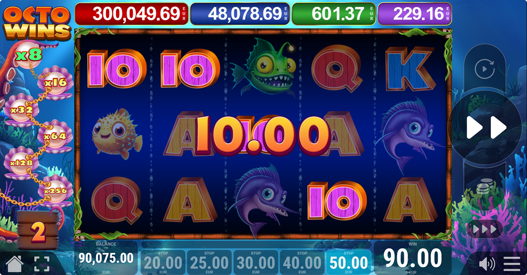
The official Octowins mobile captures use a portrait canvas with the five-reel grid occupying most of the available width. All three visible rows remain present, so the product retains its 5x3 structure rather than hiding reels behind horizontal movement. The multiplier pearl chain moves above the grid, creating a compact header for the active feature state.
Below the reels, balance and win values use large white numerals against dark panels. The surrounding decorative coral and seaweed are reduced so they do not compete with the symbol cells. This arrangement prioritises the active ways grid while preserving the underwater identity. The viewport can therefore remain narrow without changing the published 243-way format.
Android viewport behaviour
On current Android browser viewports, Octowins can scale its reel frame to the available CSS width while maintaining the relationship between symbols, multiplier markers and bottom status areas. Devices vary substantially in pixel density and aspect ratio, so responsive sizing is more important than a single fixed resolution. The official portrait artwork demonstrates a tall layout suitable for common phone proportions.
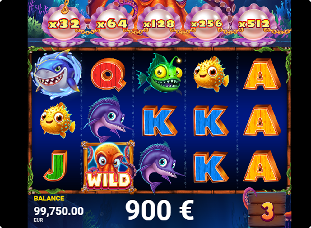
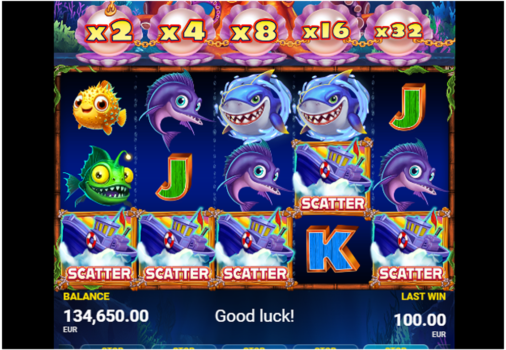
Character symbols use broad silhouettes and saturated colours that remain distinct after downscaling. The framed octopus Wild retains its WILD label, and the boat Scatter keeps its own text treatment. Buttons and status fields occupy stable interface zones rather than resizing with symbol content. These characteristics reduce layout movement when values or feature overlays change.
iPhone viewport behaviour
The same responsive product suits narrow iPhone browser viewports by placing secondary interface elements above and below the reels. Safe-area insets and browser chrome can reduce usable height, so the key product state is concentrated in the central grid. The title treatment, balance area and win panel remain readable without requiring the desktop side columns.
Retina-class displays benefit from the high-resolution character artwork used in the official captures. Fine details such as the swordfish eye, anglerfish lure and pearl borders remain visible, but recognition does not depend on those details alone. Colour, silhouette and labels carry the primary meaning. This supports consistent symbol reading across different iPhone screen sizes and display densities.
Mobile multiplier placement
Desktop Octowins scenes place the multiplier ladder vertically to the left of the grid. In portrait captures, the same pearls form a horizontal row across the top. This is a meaningful responsive adaptation because a vertical side rail would make each reel too narrow. Moving the ladder preserves both the five-column grid and large multiplier numerals.
The visible sequence can include x2, x4, x8, x16, x32 and higher values as the active section of the chain changes. Pateplay lists x5000 as the product maximum. A warm orange outline around the numerals maintains contrast against pale pearls, while the surrounding octopus and coral artwork remains outside the reading area.
Touch control hierarchy
Large control zones are positioned around the reel frame for spin, turbo, sound, menu and feature options. In a portrait layout, these controls can move below the visible crop or into compact edge groups while the central grid remains stable. The important product characteristic is that interactive areas are separated from symbol cells, reducing accidental overlap between controls and reel content.
Buy Bonus and Higher Chance use labelled panels rather than icon-only controls. When Buy Bonus opens, the feature cards, bet selector, amount and confirmation buttons fill a dedicated overlay. Green and red actions provide clear visual separation between confirmation and closing. This modal treatment is well suited to touch displays because it limits competing actions while a selection is active.
Mobile Free Spins and overlays
Free Spins transitions and result overlays scale within the same portrait framework. The official bonus capture uses a large central number for the awarded spins, while a Mega Win scene places the result title and amount over the grid. Both states retain enough surrounding interface to show that they belong to the current Octowins session.
Overlay text uses strong outlines and high contrast so it remains readable over detailed character art. The underlying grid does not determine the overlay dimensions, which helps avoid shifts when symbols change. After the message clears, the fixed reel frame and status regions provide a predictable return point. This gives feature scenes a strong visual presence without creating a separate mobile-only information hierarchy.
Responsive assets and loading characteristics
Octowins promotional artwork is supplied in wide desktop and portrait mobile formats. Using the appropriate aspect ratio reduces unnecessary cropping and keeps the focal symbols in frame. On this information site, image width and height attributes reserve layout space before each official capture loads, helping limit cumulative layout shift on smaller screens.
The critical product description, specifications and headings are present directly in the HTML, so they do not depend on client-side rendering. Images use descriptive alternative text and non-critical captures can load lazily. The visible mobile profile remains consistent with the desktop facts: five reels, three rows, 243 ways, 96.00% RTP and an x5000 maximum multiplier.